

how to design a trading card game
Designing a TCG: Design Language
What I wish I knew Before I started
I'm a technology project manager by trade and It might sound silly, but building a card game was one of the hardest projects I've ever attempted. It took five years, thousands of hours, tens of thousands of dollars, and a team that's quickly approaching twenty people.
However, I've learned so much about design, art, business, and finance that I'd happily do it again. That said, I'd definitely do some things differently. That's why I'm going to start documenting my experiences.
My goal is to write c ontent that would have been valuable to me when I started, and maybe it will be valuable to anyone else interested in pursuing a similar creative project. Let's dive right into it.
My first message to me of 2015 would be….
Start With Compelling Visual Design (what I did right)

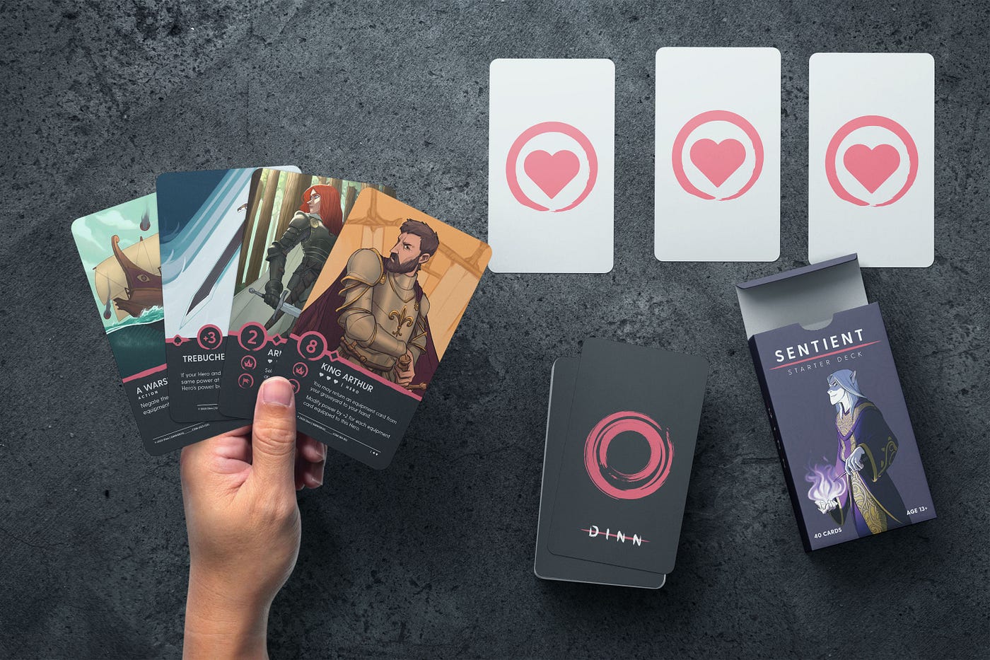
Alright! I'm going to get into the weeds a bit on this topic because it's one of my favorites. First I'll talk about how I designed Dinn's visual language, then I'll talk about what I would have done differently.
The visual language and the design philosophy behind Dinn evolved heavily over the years, but I started with the following rules:
- The text on the cards needed to be much larger than traditional card games; and
- Later on, I decided the design should reflect the actual material of the cards (paper and ink).
Larger Format
Let's start with big text. It was important to me that the text on the cards be much more legible than comparable games.
That a meant bigger, higher-contrast font. This bigger font necessitated a larger format of cards. So I opted to use tarot sized cards instead of bridge or poker sized variants.

Material Design (kinda)
At the start a took a lot of design inspiration from Google's Material Design guidelines.

However, it just wasn't working.
Material Design is really a design language that excels at orientating users when navigating task-orientated applications. I was putting it on a paper playing card. I was applying a good design language in a bad way.
So I decided on a different approach. What would happen if I took the simplicity of material design, and took it a step further? What happened if I embraced the material of the card entirely?

There we go. Now the card looks like the artist drew the illustration, then painted the design on top.
This allows us to keep the simple aesthetic of material design while leaning into the theatricality of the game.
Keep Your Audience In Mind (what I did wrong)
Dinn largely started as a passion project.
My partner and I had busy lives and we wanted to spend more time together. We both enjoyed playing card games because they fit our busy lives.
Dinn evolved out of that experience. However, at some point in time, it changed from a small passion project to a business.
The next thing I should have done is reassess every design decision that had been made up to that point — but I didn't.
A good example of this is the tarot size format for Dinn. Something I didn't consider was that the average trading card game collector uses plastic sleeves to protect their cards. It turns out that tarot sized sleeves are much, much harder to find than bridge or poker sized sleeves.
Luckily this isn't a show stopper. The larger format is more appealing to a lot of people, and would still have been necessary for other elements of Dinn.
But what if it was a show stopper? When would I have found out? After thousands and thousands of dollars of art had been illustrated for a specific size?
Good design should solve problems. It shouldn't create them. I'd urge me of 2015 to be very careful when deciding to go against industry norms. Sometimes norms are norms for a reason.
how to design a trading card game
Source: https://medium.com/@gabriel_48564/designing-a-tcg-design-language-963cc1b3e425
Posted by: sieggonvegred.blogspot.com
0 Response to "how to design a trading card game"
Post a Comment